Software is Entering It’s Porsche Era
Picture the scene. It’s 2007 in San Fransisco, and Steve Jobs has just announced the iPhone. The famed iPod, mobile phone and internet communicator all in one breakthrough was a pivotal moment in the history of all interface design. And the room of the industry’s brightest minds broke out in applause to recognise that fact that very night.
Soon after, a deluge of applications and websites flooded the app store and the internet, all built with a Jobsian sense of simplicity and clean utility at their core. The era of skeuomorphic design, where digital products were designed to look like their real life counterparts - gave way to design schemas that were far more flat and egalitarian. At this time, from 2011 - 2025, the most important thing to do to build a hit digital product was to make functional software that is easy to use, simple, intuitive and has a clean and minimal interface. And for a time this made sense. Once the product was built, its features could be kept hidden behind paywalls. Codebases were not easily accessible or replicable, and the fact that teams of people were required to make products resulted in founding teams being confident that they had established moats once their product was created. It was then left to their marketing and distribution teams to create content to defend those moats and press home an advantage all the way through to market domination and exit.
Those were the old days.
With the introduction of exponentially improving LLMs from the Labs such as OpenAI and Claude, that world has changed. To understand this, we need to look at the history of two adjacent industries; advertising and automotive design. When a medium is young, the winners optimise for clarity and function. The primary challenge is usability. Cars had to prove that they were able to replace horses. Advertising had to prove it could drive sales. Software had to prove that people could trust digital solutions to their problems. The winners are often the rational, efficient solutions, a la Ford Model T or Beetle in the car industry, early newspaper ads in advertising and minimal SaaS dashboard interfaces in software.
But as a market matures, the best practices get adopted by most of the market’s incumbents and new entrants. Pure function and utility become commoditised, and customers start looking for other forms of differentiation when making their buying decisions. This is where a fresh generation of participants - the likes of Raymond Loewy in ux design and Porsche in automotive, end up creating an impact with emotional, evocative design practices rather than focusing solely on efficiency and optimisation.
The last 15 years or so of software has been driven by optimisation culture. A hyper fixation on :
User testing
Growth loops
Design systems
Conversion rates
Best practices
Pattern libraries
But just as in the other industries, software is coming to an end of this functional era because your every day consumer can create any kind of software they want if they dedicate the number of hours and skill required. As such, to stand out we really will start to see expression as a differentiating quality between brands. That means typography, colour selection, interaction patterns and the like will become key differentiators. The “craft” of an application will be a key point in how much it is adopted. Perhaps the most glaring example of this can be seen at the pinnacle of the AI race.
Likewise, in software, we are ending the functional era because people can make any kind of software with enough hours and skill, and now we move into the expression era where branding, colour, typography, interaction and the like become differentiators. The craft of an application will be a key point in how much it is used. Consider for example Tripadvisor vs Airbnb, this was an early version of it. The greatest example at the moment is the difference between Anthropic and Open AI.
To illustrate, we've attached OpenAI and Anthropic's brand guidelines here:
OpenAI’s brand and product user interface is simple and functional. It is clean, black and white, quite minimal, utilises a flat logo design. By all intents and purposes, it is a strong and industry standard experience judging by the last 10 years of design. However, if you contrast that with Anthropic on the other hand - Claude uses a design system built around earth tones and calming and grounded human centric typography that makes AI feel approachable and even friendly. You see it in naming conventions Haiku, Sonnet, Opus - all named after forms of poetry or music. That goes a long way towards the felt experience of using products in Anthropic’s ecosystem.
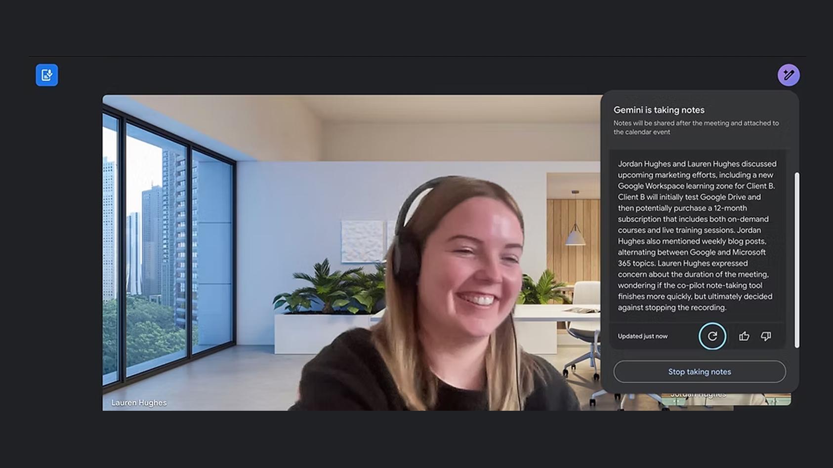
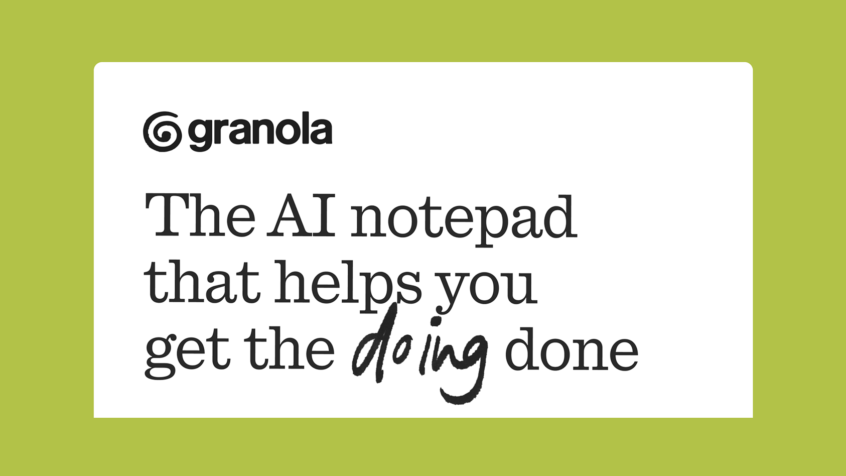
The same can be said for Granola, the London based note taking app that again is competing against Google Notes and Otter. Again, where Google goes for functionality and Otter plays it safe, Granola has gone for a distinctive humanised approach - from the name through to the green earth tone colour palette, it has taken an opinionated stance towards design.
And finally, we have Nothing Tech. In a significant departure from the clean polish of Apple’s AirPods and Beats Headphones, Nothing takes inspiration from a hyper futuristic art direction and commits all the way to it. Again, the signature type of Nothing is very distinctive too. The last example is Lovable. Before Lovable people who wanted to build their own website would use SquareSpace, Webflow or Framer. All of whom had very strong, clean user interfaces. However Lovable owned a colour, purple. The storytelling around the AI is that it is Lovable. Again the positioning here is that new products are aiming to convey a love for the consumer and a humanity that makes their adoption much smoother compared to Codex and Replit who are more reflective of the legacy model of digital brand building.
What does this mean for designers and product creators and marketers?
It means that if you want to stand out now, you cannot simply deliver what is expected of you. You have to take inspiration from influences outside of the internet and Pinterest. Take the risk and depart from flat designs and push towards something different on at least one axis - it could be colour, typography, imagery, art direction. You want to have at least one distinct point of departure compared to the rest of your industry - that will go a long way to creating mindshare, which is what really matters.
In a world full of Fords, create Porsche.